
How to Design Engaging Blog Posts in WordPress Using Gutenberg Editor (View Examples)
Discover unique design ideas & features that can make your blog post more interactive & engaging. Make your post stand out & capture your readers’ attention!

Designing webpages and blog posts is one of the things that makes blogging so fun for me as a creative.
It feels like I’m putting together my own magazine filled with my thoughts and experiences, basically, my life! There are pros and cons to this, but one big reason I do it is to give my readers a better experience. As bloggers, that should be a top priority. Engaging content is everything!
By the end of this post, you’ll have a better idea of how to design your blog posts using Gutenberg, along with different design styles, layouts, and features I’ve used in mine.
Specifically, we’ll talk about:
- My Experience in Using Gutenberg
- Goal in Designing
- Gutenberg Blocks
- Different Blog Post Designs
- More Tips for Designing Blog Posts

Hi! It’s Eljon and I want to welcome you to my blog, Explore to Thrive.
Here, I share my experiences with traveling, reflections on spirituality, personal growth and insights on building an online business, all to make a difference.
But my mission goes beyond that. You can learn more about what I do by visiting my homepage or by subscribing to my newsletter.

My Experience in Using Gutenberg
For my blog, I use WordPress with the default Twenty Twenty-Four theme Kadence Theme I rely on Gutenberg, WordPress’ built-in block editor, for almost everything design-related, including the header, sidebar, footer, pages, and posts.
One big reason I stick with Gutenberg is that it’s free, works seamlessly with WordPress, and stays compatible with other themes if I ever decide to switch.
Compared to Elementor or Divi, Gutenberg is definitely less powerful since it’s just a basic tool for designing webpages. It doesn’t have built-in pop-ups, fancy forms, scroll animations, visibility settings, or other advanced features. But for most bloggers, it gets the job done. You can control things like element sizes, layouts, colors, positioning, brand fonts, and more.
Gutenberg is pretty easy to learn, and I’m sure you’ll pick it up quickly, just like I did.
A good way to start is by watching a YouTube tutorial for beginners. It explain blocks, toolbars, and settings, which can save you a lot of time.
I figured it out in a day by watching tutorials, trying things out, and testing different designs.
If you want in-depth details about Gutenberg Blocks and the Editor, you can check out its documentation here.
Couple tips for studying Gutenberg.
First tip: Take a close look at the different settings in the block settings panel, especially the ones under the Style tab. Depending on your design goals, you may need to adjust various options related to color, typography, dimensions, borders, and advanced settings. In my case, I often adjust the settings in the Dimensions panel, especially the padding and margin. I change the default values to create space between blocks for a cleaner, more polished look.
Second tip: It’s also important to understand different CSS dimension units like pixels, em, rem, viewport sizes, and percentages since they play a key role in making your blog post look good on different screen sizes and devices.
Goal in Designing
While aesthetics are nice for pages like our About pages, the reading experience should come first for blog posts. Our goal is to make posts easy to skim and read so our readers can get the message, find answers to their questions, or at least not be put off by a messy layout that makes them leave.
Gutenberg Blocks
Creating well-designed blog posts in Gutenberg is pretty simple with its built-in features. In fact, I only use a few blocks to achieve different layouts for my blog. The ones I use the most are:
- Text Blocks: Details Block
- Media Blocks: Cover Block
- Design Blocks: Column, Group, Row, and Separator Blocks
I’ve also experimented with Stack, Grid, and Button Blocks, which are also under Design Blocks, but I haven’t used them much yet.
With just these blocks, I’ve transformed my blog posts from a plain, scroll-heavy layout into something that feels more like an interactive magazine.
Different Blog Post Designs
To show how I use Gutenberg to design my blog posts, I’ll give you some examples.
Actually, every post on this blog is an example. If you check them out, you’ll notice that almost none of them look the same. That’s because each post has a different purpose, and every purpose calls for its own style, layout, and features.
For example, a blog post that tells a story should have a design that helps readers follow the sequence of events, while a listicle should make it easy for them to skip parts they’re not interested in.
In this section, we’ll go over the styles and techniques I use for my blog posts and the steps I take to apply them. See a quick summary here.
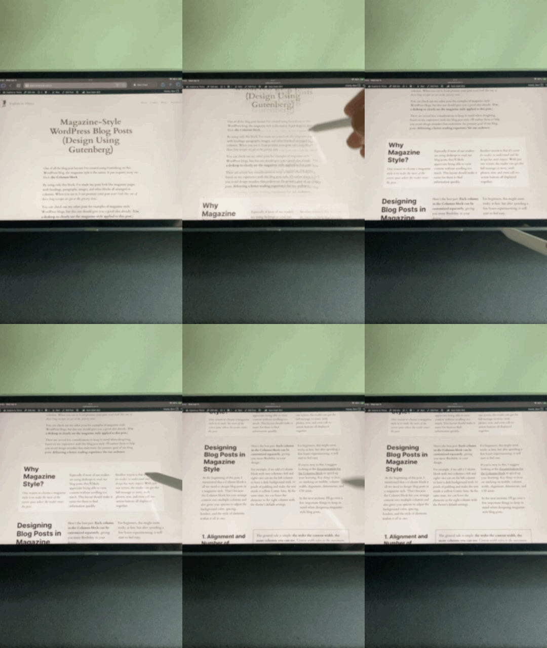
1. Magazine Style Layout
Of all the blog post layouts I’ve created, the magazine style was the easiest to design.
It only uses the Column Block, which helps display more content on a single screen (desktop). This reduces the need for readers to scroll just to get more information. Ideally, on a desktop, readers should be able to take in most, if not all, of the main idea in a single view, just like reading a printed magazine.
Click to learn more: Magazine-Style WordPress Blog Posts (Design Using Gutenberg)
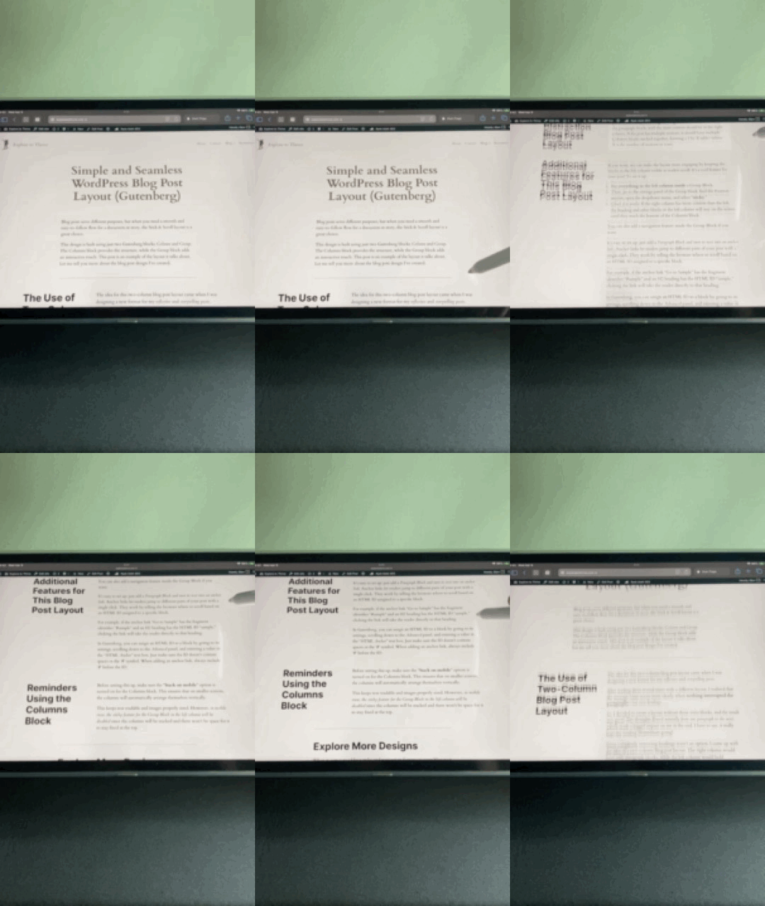
2. Stick & Scroll Layout
Stick and Scroll is another simple layout I made. It has two columns and only two design blocks: Column and Group Blocks.
The goal of this layout is to create a more seamless reading experience by placing all the paragraph blocks in one column and the rest in the other.
Click to learn more: Simple and Seamless WordPress Blog Post Layout (Gutenberg)
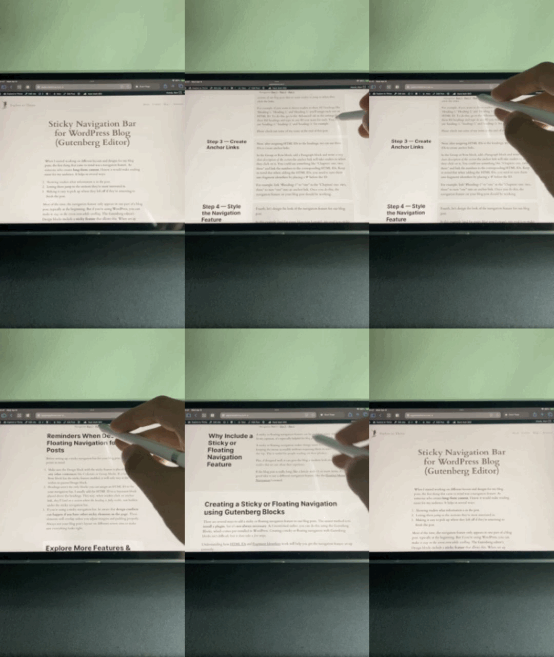
3. Sticky Navigation Bar Feature
I’ve also created a cool feature: a sticky navigation bar that lets readers easily jump to different parts of the post. It stays at the top of the screen, so it’s always available, whether on mobile or desktop.
This is super helpful for longer posts with several sections. With just one click, readers can quickly skip to whatever part of the blog they want to check out.
Click to learn more: Sticky Navigation Bar for WordPress Blog (Gutenberg Editor)
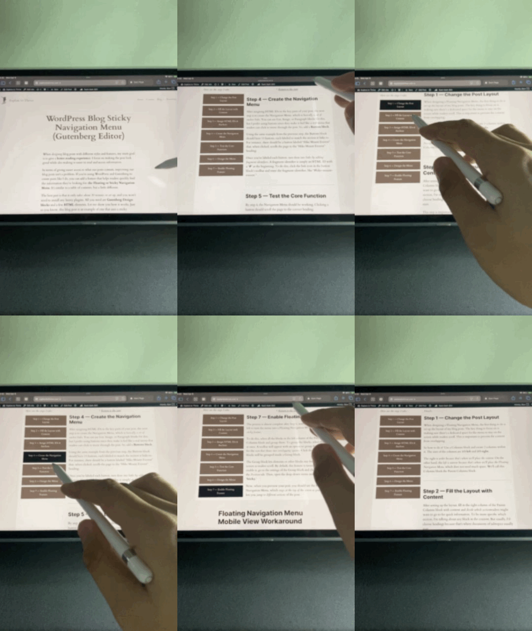
4. Floating Navigation Menu Feature
Another feature I’ve added is a Floating Navigation Menu, which works similarly to the Sticky Navigation Bar but with a different design and way of accessing shortcuts to different parts of the post.
This feature is perfect for longer blog posts, like listicles or detailed guides, where the topics wouldn’t fit on a Sticky Navigation Bar.
On desktop, the menu stays on the side, while on mobile, readers need to click an element to bring the menu back up.
Click to learn more: WordPress Blog Sticky Navigation Menu (Gutenberg Editor)
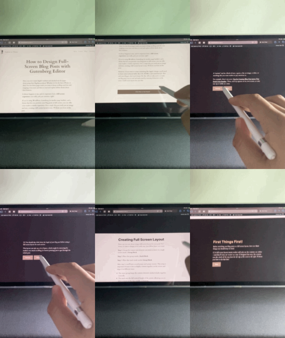
5. Full Screen Layout
If you want a more unique way to present your ideas in a blog post, a full-screen layout might be a better option.
It’s a bit harder to create than the magazine style because it involves nested design blocks. However, it can be more engaging for readers since the content is shown without distractions (at least on a desktop screen).
You can also combine this layout with features like a navigation bar, which helps readers jump to different sections without scrolling too much. Adding a navigation bar can give the layout a PowerPoint-like feel.
Click to learn more: How to Design Full-Screen Blog Posts with Gutenberg Editor
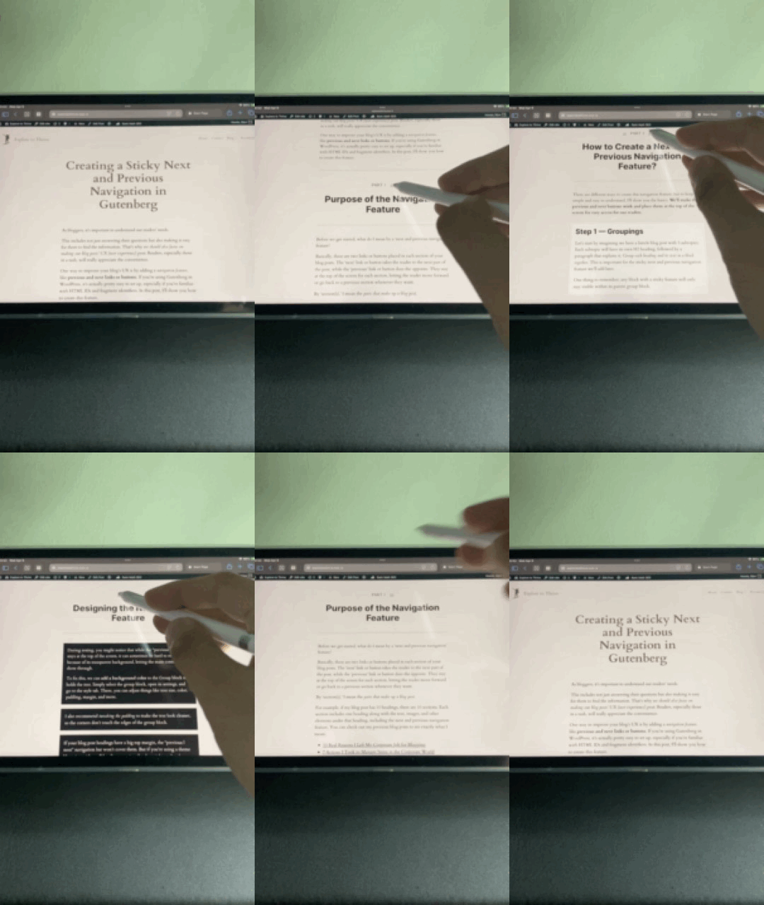
6. Previous-Next Navigation Feature
Like the features I mentioned earlier, this one makes it easier for readers to move through the blog post quickly. It’s simple to use since it just involves previous and next buttons to jump between sections.
However, setting up can get tedious if the post is long and has a lot of headings. That said, this layout works great for step-by-step guides or posts that need to follow a specific order.
Click to learn more: Creating a Sticky Next and Previous Navigation in Gutenberg
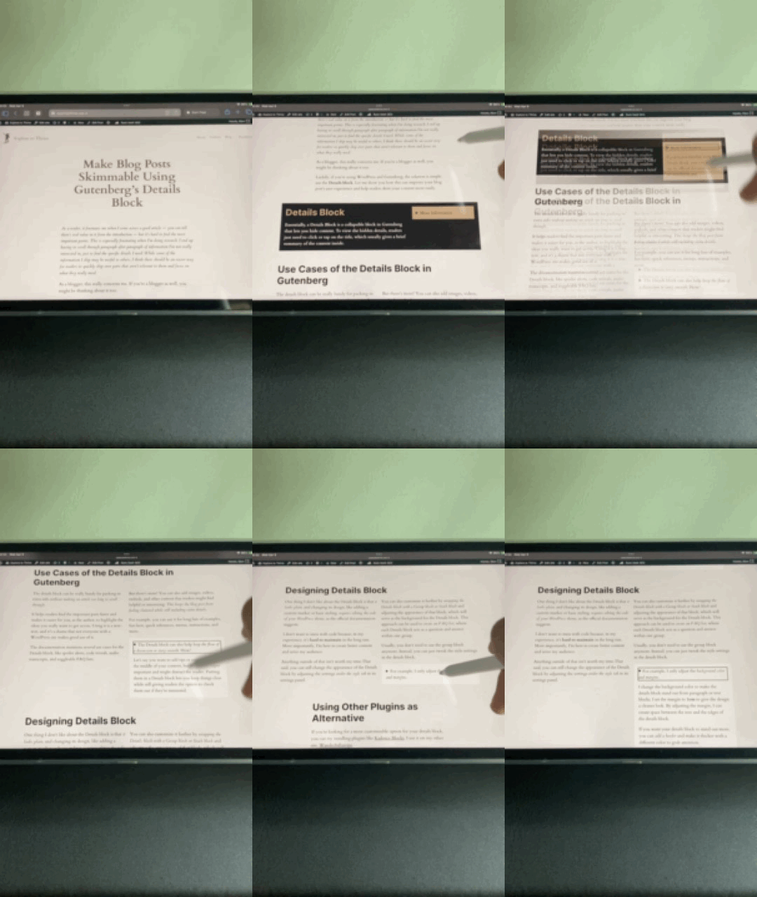
7. Easy-Skim Layout
One way to improve the reading experience for our audience is by hiding details that aren’t necessary right away, showing them only when the reader wants to know more.
Using the Detail block in Gutenberg, we can achieve this easily, helping us create a blog post with an Easy-Skim Layout.
Click to learn more: Make Blog Posts Skimmable Using Gutenberg’s Details Block
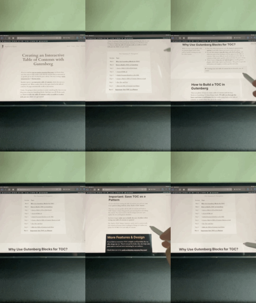
8. ToC & Sticky ‘Back to ToC’ Feature
To give readers a quick overview of what they can find in our blog posts and let them jump to the sections they’re most interested in, this feature helps with exactly that.
It’s similar to the two features I mentioned earlier, but simpler, as the table of contents doesn’t stay fixed at the top of the screen and just appears after the introduction.
Click to learn more: Creating an Interactive Table of Contents with Gutenberg
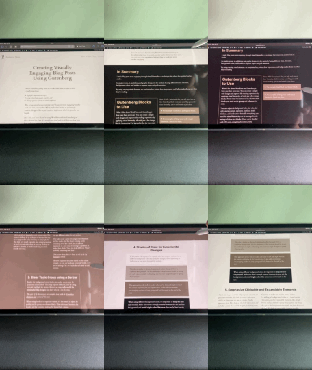
9. Visual Hierarchy
Finally, designing blog posts doesn’t have to be complicated, and you don’t need interactive features to boost reader engagement.
Sometimes, all it takes is placing related content in a box or changing the background of a section to make it more interesting and keep readers focused.
Click to learn more: Creating Visually Engaging Blog Posts Using Gutenberg
More Tips for Designing Blog Posts
Besides the tips I’ve already shared for each style and feature in other posts, there’s one more thing to pay attention to: how your blog posts will look on desktops, tablets, and phones. Most Gutenberg blocks adjust to different screen sizes on their own, but some settings (like fixed widths or certain toggles) can mess with that.
For example, the ‘Stack on mobile’ option in the Column block can change how things show up on smaller screens. That’s why it’s a good idea to check how your posts look on different devices before you hit publish.
If you’re using Chrome or Edge, you can turn on developer mode to see how your blog post looks on almost any device. I usually test it on different screen sizes, from smaller phones like the iPhone SE to bigger ones like the iPhone Pro Plus. I also check how it looks on foldable phones like the Galaxy Z Fold and Flip, tablets like the iPad Mini and iPad Pro, and on desktop screens.
Thank you for reading
I hope my insights and experiences inspire you to start building your own online business. Before you leave, if you haven’t already, check out my home page to learn more about my journey as a creator. Come join me!
For new posts and updates on how I am growing this blog, subscribe to my newsletter.